Ask an Expert:
Type Design with Chank Diesel, Font Pioneer
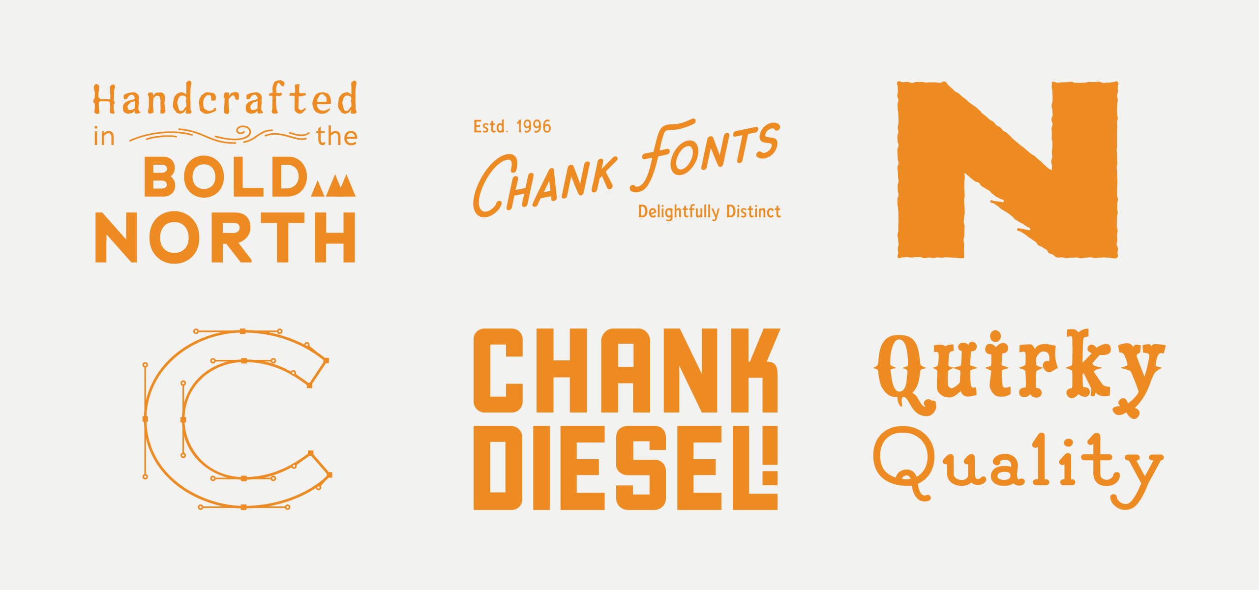
Chank Diesel is a pioneer in the world of type design with more than 25 years of experience. He creates fonts and related art from his home office in Northeast Minneapolis. Chank’s work has been featured in the Smithsonian, on packaging for countless brands and on numerous music albums, including several by Prince. He has been profiled by many publications, including the New York Times and Wall Street Journal.
Q: First question, what’s the story on how you got the name Chank?
A: My name is Charles and when I was a kid, my friends called me Chanky after Spanky from the Little Rascals. Chanky became Chank and it just stuck.
Q: How did you get into the creative world and what drew you to Minnesota?
A: From an early age, I was always interested in type and letterforms. I grew up in Florida and my parents encouraged me to go to Macalester College, which I did, graduating with a degree in fine art.
College was a great time because I learned about painting, sculpting and printmaking. And I learned a lot about Minnesota and the inspiring creative community in the Twin Cities. Macalester didn’t have a design program, so I did design as a hobby and worked with the college newspaper, which is where I learned how to work with type, fonts and leading. Fast forward through moves to the East Coast and then the West Coast, and I was drawn back to Minnesota, specifically Northeast Minneapolis, and have been working with fonts for more than 25 years.
Q: At what point did you realize you could make a career out of designing fonts?
A: In college, I worked with CAKE magazine, first as art director, then as editor. It was there I created my first fonts for use in the magazine. After about a year I thought it might be a good business endeavor to do fonts full-time selling them to small businesses. I sold those first fonts for about $30 each to individual end-users and font collections I sold to record labels and ad agencies for about $300.
I eventually worked with distributors who helped get my fonts out and I was able to earn royalties off those. My first royalty check was $750 from T.26 out of Chicago. That experience was pivotal and inspired me to keep going.
Q: Your fonts can be licensed through Adobe and they are huge in the design world. Did Adobe approach you or how did that come about?
A: It’s always been important for me to work with small businesses and nonprofits. Typekit, a small startup in San Francisco, wanted to use a number of my fonts after one of their designers I previously worked with recommended me. Typekit was eventually acquired by Adobe, so I kind of snuck in through the back door. Typekit offered fonts to use on websites, which wasn’t a service that was really available at the time. And then around 2008, there was a change in web protocols that allowed web fonts to easily be displayed. Before that, Georgia, Verdana and Arial fonts were pretty much the only options we had for web fonts. Once the opportunity arose for more web fonts, I was able to license fonts to Typekit, and those fonts are now available through Adobe. I have about 100 fonts available through Adobe for users at no additional fee.
The typeface a brand chooses is the voice of the printed word. What voice do you want your brand to come across as?
Q: You must have some favorite fonts and role models in the field of type design, right?
A: My favorite fonts change over time, but one of my current favorites I created is called Liquorstore. I love how it’s so utilitarian and versatile. It gets used in a lot of different contexts and you can add effects to it like double highlights and drop-shadows. I based that one off of lettering from the old River Liquor Store in Northeast Minneapolis.
My favorite font by someone is else is Cooper Black. That font was used on the old Payless Shoes logo, on the album title for Pet Sounds by the Beach Boys, in the credits for the Bob Newhart Show and countless other displays. It makes me laugh when I see it because the font is so fat, friendly and clean.
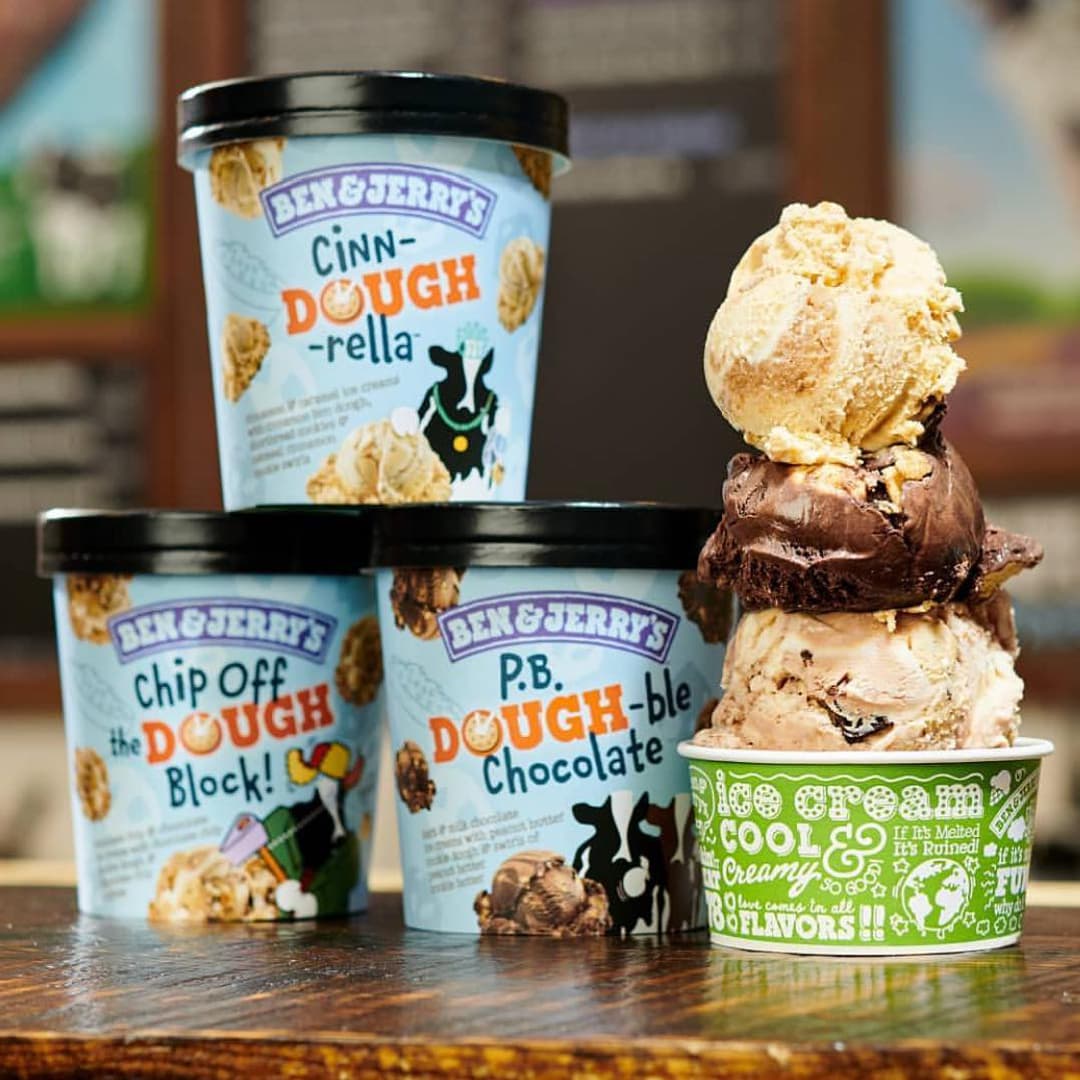
Another font of mine that stands out is Chauncy Fatty. It’s been used on Crayola boxes for more than 15 years. It just looks fun and has a childish, creative spirit to it.
As far as role models in type design, Oswald Cooper who created Cooper Black stands out along with Jim Parkinson who created the font used in the Rolling Stone magazine logo.
Q: People outside of design may not think of the role type design plays in branding. How would you articulate the importance of fonts on the impact a consumer has with a brand?
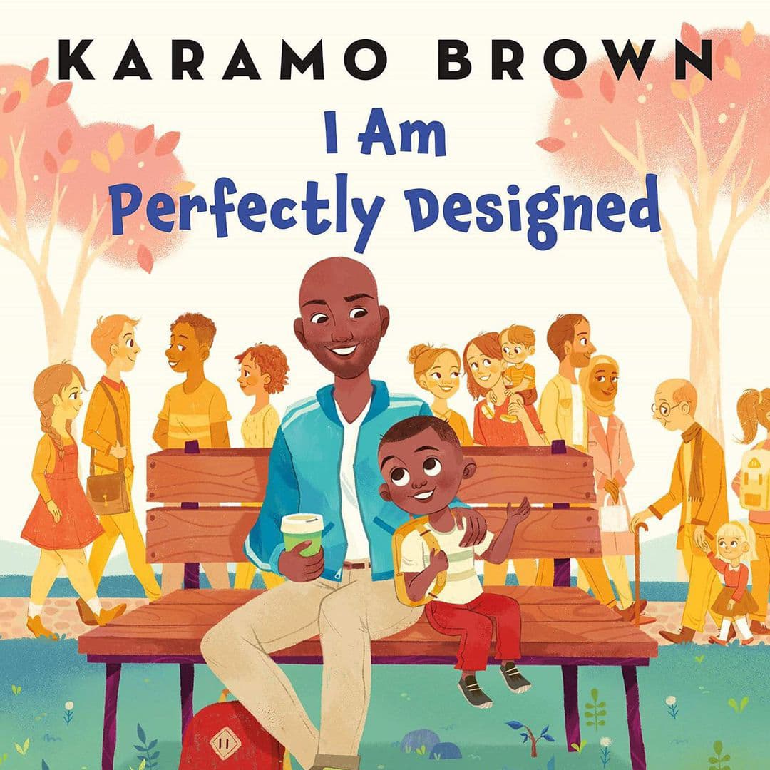
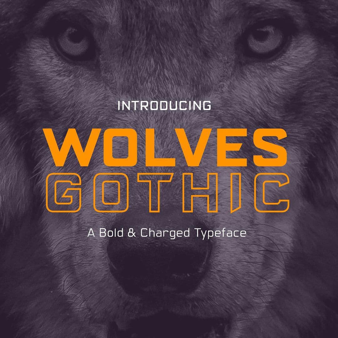
A: The typeface a brand chooses is the voice of the printed word. What voice do you want your brand to come across as? Type has emotion and personality. A font makes you feel a certain way. For example, Comic Sans makes some people say ‘I hate that font!’ while others say ‘It’s the fun font!’ Serif vs. sans serif fonts – they give you different moods. Typography is a way brands can differentiate themselves from competitors.
Q: Are there consistent factors you take into consideration when you’re designing a new font?
A: Sure, one always has to think about what is appropriate for the brand, how the font will look in different mediums and how it looks at different sizes.
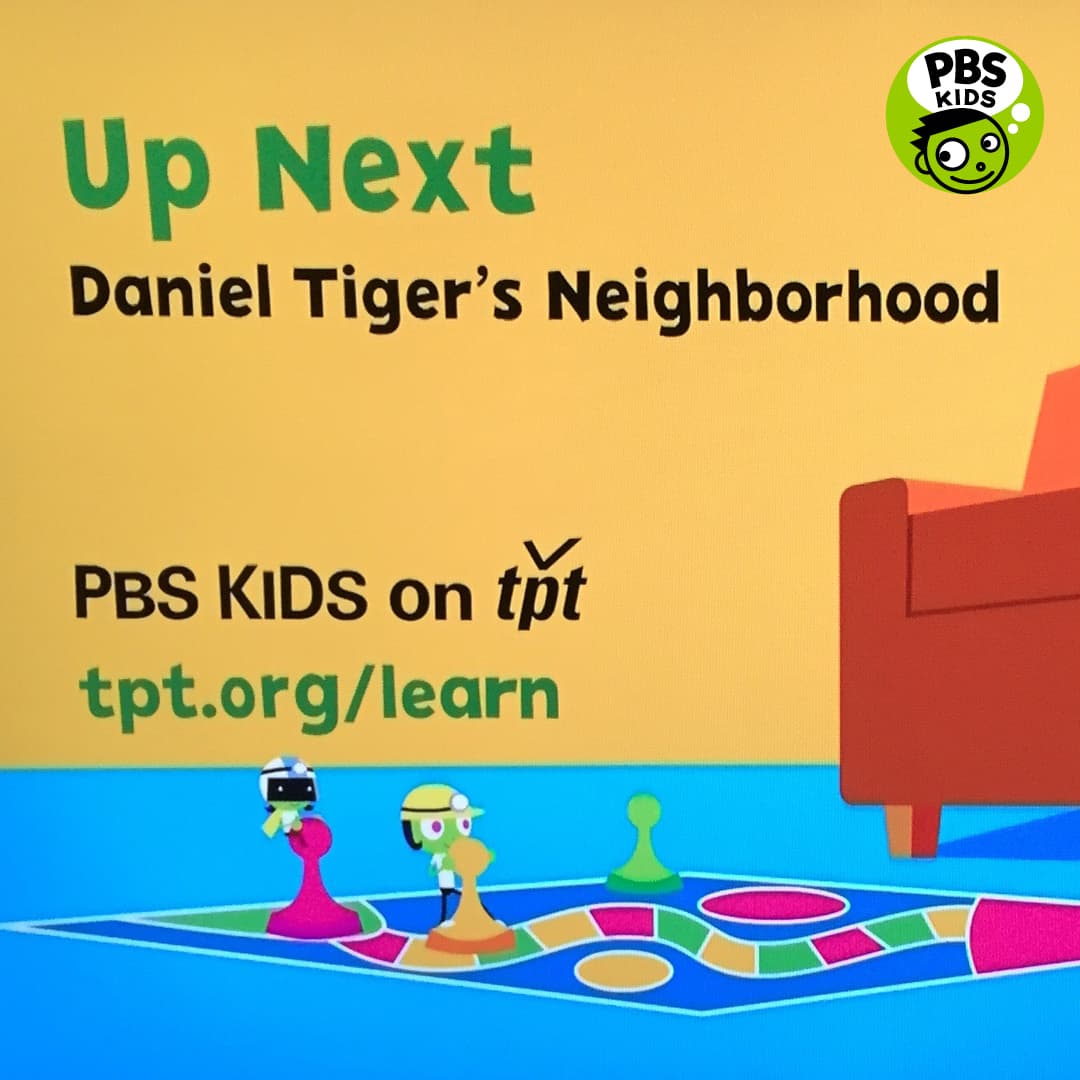
I also spend a lot of time thinking about specialized factors. For example, I created the PBS Kids font and that’s one of my favorite fonts too. That font is childish, friendly and approachable – and, of course, it had to look good on a TV screen. I had to allow for the brightness and the contrast of colors and not take away the legibility of it.
Q: In your opinion, what are the key features of a great typeface?
A: First, a font has to be readable. A cool font that isn’t readable is not very useful. Next, a font should have personality. What kind of person would the font be? The third feature would be functionality. What is the purpose of the font? Where will it be used?
Q: What projects were you most excited to work on?
A: PBS Kids was fun to work with and it was awesome to have that reach to every TV across the country. I really enjoy kid fonts so it felt perfect to work with them.
I’ve done some work with Major League Baseball and they featured my Liquorstore font in the 2015 World Series logo. That organization has been around for 100 years and I was proud to be a part of their great tradition.
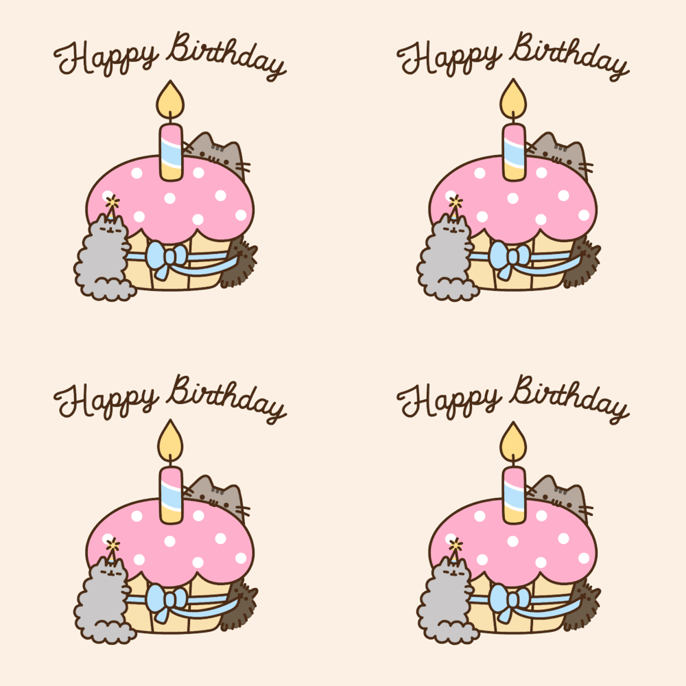
I made two fonts, Pusheen Tall and Pusheen Cursive, for Pusheen the cat and I’m crazy about those. It’s an exclusive font made just for them that is fun, cute and charming and cat-like in its curiosity. It’s definitely part of their brand, part of their voice.
I worked with the San Francisco Silent Film Festival as they were transferring the film “Good Bad-Man” to digital. That was made in 1916 and back then, they used hand-drawn title cards to convey dialogue or scene descriptions. I recreated the type of font used on the film and so many silent films of the day. That font is now available with Adobe and is called Good Bad Man.
Back in the early 1990s, Prince went by a glyph symbol and it drove me crazy to put the same symbol in all my fonts when I worked at CAKE magazine. So I designed his symbol into all of my fonts like it was any letter of the alphabet. Paisley Park saw my work, bought those designs and used several of the fonts on various Prince albums.
Q: Describe your process of creating fonts.
A: I typically end up with about three iterations as I’m creating a font. I provide clients with an initial sketch about a week after getting feedback from them on what they need and what the font should do. That initial sketch might be a pencil or ink drawing or a rough vector graphic, but it’s something the client can react to and provide feedback on. About two weeks after that, I make a functional font for them with the alphabet, numbers and some punctuation so they can play around with it a bit. And once they’ve had a chance to work with it, I get more feedback and complete the character set. By that point, it’s pretty accurate for what the client wants, but if needed, I do another round of revisions about 30 days later.
I like to present the font as art. When I render it in pencil, it has a different look and feel. I like clients to see the fonts as sketches first so they can get a feel for it and provide feedback before they become vectors.
For me, putting together a font is a lot like putting together a jigsaw puzzle where all of the pieces have their proper place. There’s a difference between drawing letters and drawing letters that work well together.
Q: How do you draw inspiration when you begin a project and how do you stay creative through the process?
A: All of the fonts previously made are inspiration and I get ideas from comics and old signs. A lot of times I use a creative mood board for client considerations such as wanting a font that is “spooky but not scary.”
I have more of an issue of dialing back the creative through the process. Creativity starts the project and then it gets more technical with the renderings, so there’s naturally less creativity as I move forward.
Q: What are the tools you typically use?
A: Of course, there’s pencil, pen and paper for sketches. Adobe Illustrator is a good program for drawing vectors. I used to use FontLab, but nowadays I use a program called Glyphs, which has a number of cool features such as a grid so it’s easy to check off the letter, number and symbol variations. I eventually take the work into InDesign where I work further with different combinations of letters, words and sizes and switch all of the developmental fonts in progress and I can see how all of the new letters are coming together. Then I’ll flip it back to Glyphs and make more changes there.
Q: Have you noticed different artistic directions in the industry since the pandemic started?
A: In the font industry, people have a lot of free time on their hands so lots of people are playing around with new fonts and new tools. There are a lot of cool fonts coming out now, but you won’t likely hear about them for a while because good fonts need some time to age.
I am surprised by the number of cursive fonts coming out now because cursive isn’t taught in school any more. Will people know how to read that in the future? Will brands use cursive fonts if the audience for it is limited?
Q: Final question, any additional considerations for type design in branding?
A: Remember, you’re using type design every day in a number of ways and your fonts are part of your brand personality. Does your type design fit the brand personality you want to have and separate you from competitors? A custom font can be really powerful for brand identity and is worth considering.
Thanks to Chank Diesel for taking the time to sit down with us! You can find his work at Chank Fonts!
Ask an Expert is an occasional series from Voom CreativeTM to dig a little deeper into various marketing and communication related subjects of interest to our clients. Email us with marketing topics you would like to see addressed!